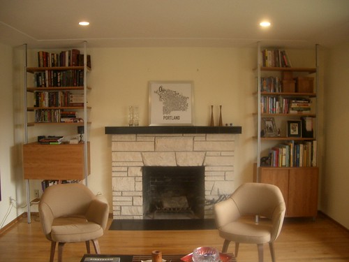
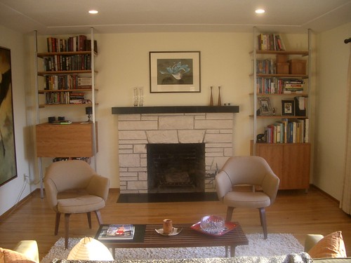
I know, but I'm lazy and the Harper print has a fancy-pants hanging system. My friend Marcia likes the Portland poster but with a really big frame and matte. In any event, which do you prefer, color or B&W?
The Atlas system looks totally cool but painfully expensive. Not that the ISS Designs stuff was Wal-Mart cheap or anything...
4 comments:
I hate to say it, but the fact that the B&W one is hung and the other is set on the mantle makes more of a difference to me than the art itself.
I love the shelving system. Reminds me a bit of the Atlas system.
I know, but I'm lazy and the Harper print has a fancy-pants hanging system. My friend Marcia likes the Portland poster but with a really big frame and matte. In any event, which do you prefer, color or B&W?
The Atlas system looks totally cool but painfully expensive. Not that the ISS Designs stuff was Wal-Mart cheap or anything...
I like the color but I'm a color whore. The B&W has more street cred so both are cool.
Atlas is expensive indeed. Yours has more shape definition, with the corner posts. Good choice at any price.
I have the slightly smaller, green version of the Portland poster, too. My friend Marcia suggested putting that in an oversized frame and matte.
Hey, what's up with the shipping container project? No dates on the Hutchkraft site...
Post a Comment